Pitfalls to Avoid When Setting up a Landing Page
Landing pages are a great tool for small businesses looking to grow. But, as with everything else in life, they are only great if you make them great. Execute the landing page poorly, and it will bring nothing but frustration and misery. Below you will find the top four most common pitfalls small businesses make when setting up a landing page. Make sure you avoid these to make your landing page a great success!!
1. Having excessive navigation links or any other distractions
Unlike a web page, your landing page has a single purpose: make your visitors excited by offering them something of value in exchange for their personal information (such as an email or telephone number). It really is as simple as that!! Dont worry about including navigation menus, blog posts links, lots of offers, or pack it with information, it really can be “barren” or, in other words, simple, dedicated and focused to its only purpose, to convert people. Less is truly more here!
Therefore, building your landing page starts by focusing on both getting and keeping your visitor’s attention on the single offer you give. Let’s imagine that they are searching online for a “bike store near me”. Once they reach your landing page, they should be presented with the main prize – your offer to provide them with a 10% purchase discount voucher to spend in store or online if they leave their details. They should not be distracted by navigational links that take their eyes off this prize or by too many clickable elements placed above your headline. Keep things simple and focus on the goal at hand and the best results will follow!

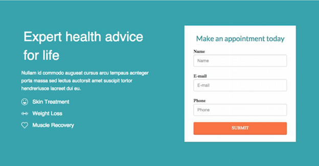
The landing page is a simple but powerful tool [Image Credit: GoDaddy]
2. Not keeping the Call To Action above the fold and/or clearly visible
“A bad first button CTA in your welcome email kills your subsequent onboarding emails. Give value!” – Alex Williams, Senior Vice President at Trendline Interactive
What is a call to action? Simply put it is an image or a line of text that prompts your visitors, leads, and customers to take an action. Quite simply they read the text and then need to click or do something. You have probably seen a CTA countless times: “Download here”, “Get your free trial now”, or “Sign up today!” These are all CTAs. Your call to action button (CTA) needs to stand out and capture your visitor’s attention by being placed in a prominent place on the landing page.
This means the CTA should not battle it out with useless links or other unnecessary design elements on the page. If you make your CTA button small, it will likely fail to convert, and you may lose valuable customers. To avoid this, try these best practices:
- The position of your CTA will depend on the complexity of your landing page. You have two options. If you have a short landing page with less information on it, it is best to put the CTA above the fold. On the other hand, if you opt for a longer page that contains more detailed information about your offer, it means that your CTA can do just as well if it is placed below the fold.
- Do not be afraid of the impact of the length of your landing page on the visibility of your CTA button. As long as you present essential information in clean and uncluttered manner, the visitors will have no problem with scrolling to the bottom of the page to click on your CTA. Research shows that pages with the CTA button placed as part of a longer and simpler layout recorded a conversion rate that was 220% higher compared to that of page with shorter and more complex design.
3. Cluttering the page
Navigation links are not the only thing that you can design poorly, and which can have a negative effect on your landing page. It’s too easy to fall into the trap of designing a landing page that is easy on the eye, but does not fulfill its primary task. Yes, you want everything to look appealing, but do you really need to include feeds from your Instagram or Facebook page, or to see all all the ebooks you wrote? The answer is no, as anything that clutters your landing page increases the chance of your visitors leaving without converting as it is too hard for them to search for your important content.
It’s understandable that you want to have both text and awesome multimedia on your landing page however, it is possible to have too much of a good thing when it comes to visual elements on your landing page! Instead, opt for a nice and clean design, organized around presenting your one and only offer. Do not become a part of a (surprisingly) large group of people, a whopping 48 percent of them, who put multiple offers on their pages, only to confuse the customer and have none of them convert.
4. Create More Landing Pages to Generate More Leads
When it comes to gathering visitor contact info through landing pages – the more, the merrier. Research has also confirmed this – businesses that increase the number of their landing pages from 10 to 15 see an increase in lead generation of 55 percent!
So what’s the big deal? It’s quite simple, really. More landing pages means more offers, more content and subsequently – more opportunities for you to attract more visitors.
When having different landing pages make sure that each one offers something different so that you can better target different buyer personas with them.
Once you get the hang of how to building landing pages, you’ll be able to create many news ones in just a few moments!
Wrap Up
So, what’s the best way to avoid making all these landing page mistakes? With smoove‘s landing page builder, you can easily avoid these pitfalls. The landing page builder comes with templates which will make sure you stay away from using navigation menus, or having a poorly positioned CTA. It can also help you with the design, making sure you’re not cluttering your page, with too many offers or excessive visual elements by providing best practice templates.
One other great bonus with smoove, is you can also create multiple landing pages, boosting those conversion rate numbers with ease.
Remember your landing page occupies a crucial place in your marketing efforts as it is a focused meeting point between your business and your potential customer. To get the most from this interaction, your landing page will have deliver just one goal: to make your visitor give you their contact information in exchange for your unique offer.
Avoid all the pitfalls mentioned here and make your landing page a great success!


Leave a Reply
Want to join the discussion?Feel free to contribute!